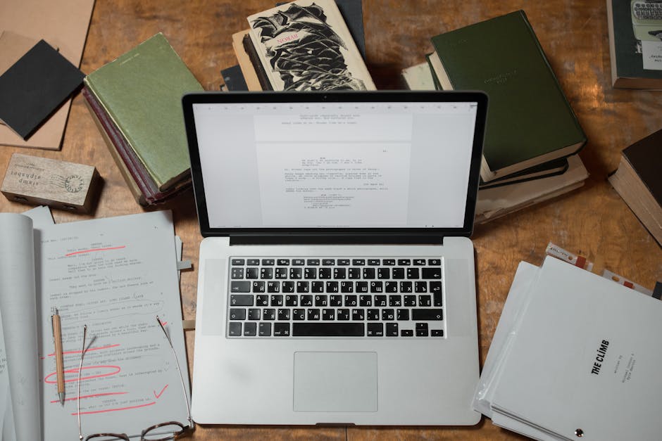

Book layout is the backbone of how your book looks and reads. It's the work of arranging text, images, white space, and typography into a cohesive design that guides readers smoothly through your pages. Good layout is invisible—readers don't notice it, they just turn pages comfortably. Bad layout? That's all they notice, and they'll put the book down.
If you're publishing a book—whether it's a novel, textbook, memoir, or professional guide—understanding book layout helps you make smarter decisions about your project and communicate better with the professionals who'll handle it.
Related: Book Formatting: A Complete Guide to Professional Layout
Related: What Professional Book Editors Do: A Complete Guide
Related: What Does a Book Editor Do? Complete Guide
Related: What Is Professional Book Typesetting? Complete Guide
What Exactly Is Book Layout?
Book layout is the graphic design discipline that determines the visual and physical characteristics of a book. It's not just how things look on the page; it's how every element works together to create an experience for the reader.
Here's what book layout includes:
- Margins and white space: The breathing room around text that makes pages feel uncluttered and easy on the eyes.
- Typography: Choosing fonts, sizes, and spacing for body text, headings, and special elements like pull quotes.
- Column layout: Deciding whether your text runs in one column, two, or more (common for reference books).
- Headers and footers: Page numbers, chapter titles, or other repeating information that orients readers.
- Image placement: Where photos, illustrations, or diagrams sit on the page and how text wraps around them.
- Line spacing and leading: The vertical space between lines of text, which affects readability and how many words fit per page.
- Chapter openings: Special formatting for the start of each chapter to signal transitions.
All of these decisions affect how readers experience your book—from how fast they can read to whether they feel engaged or exhausted.
When Does Book Layout Happen?
The timeline matters. Book design work typically begins after you and your editor have completed the manuscript. You don't want to finalize layout while the content is still changing, because edits might shift pages around and undo all your careful spacing.
Here's the typical order:
- Manuscript is final: All writing, editing, and revisions are done.
- Layout design begins: A typesetter or designer creates the template and applies it to your pages.
- Author reviews: You check proofs to catch spacing issues or formatting errors.
- Final tweaks: Small adjustments are made before printing or digital publishing.
Starting layout too early means rework. Starting too late means rushed quality. The sweet spot is when your manuscript is truly final—no more major revisions expected.
Key Layout Elements That Matter Most
Not all layout decisions are created equal. Some have a much bigger impact on how readers experience your book.
Margins: Your margins are your first impression. Too narrow and the page feels cramped. Too wide and you're wasting paper and raising printing costs. Standard margins for most books fall between 0.75 and 1 inch, but it varies by book type. A luxury art book might have wider margins. A dense textbook might be tighter.
Line length: How many characters fit on each line matters for readability. Too long and your eyes get tired tracking back to the start of the next line. Too short and your eyes bounce too much.
Typography: Your font choice sets the tone of your book. A serif font like Garamond feels traditional and literary. A sans-serif like Helvetica feels modern and clean. Size matters too—body text usually sits between 10-12 points, depending on the font and how much space you have.
Hierarchy: Readers need to understand what's important. Your heading styles, bold text, and spacing should create a clear visual hierarchy so someone can scan the page and know what they're looking at. Chapter titles should look different from subheadings, which should look different from body text.
Different Types of Books, Different Layouts

Not every book needs the same layout approach. The content and purpose of your book should shape your design decisions.
Fiction novels: Usually simple—one column, serif font, clean white space between chapters. The design stays quiet so the story stays central.
Non-fiction and reference books: Often more complex. Multiple columns, sidebars, callout boxes, and index references help readers find information quickly.
Illustrated books and art books: Image placement is everything. Layout needs to balance text and visuals so neither gets cramped.
Textbooks and academic books: Dense information requires careful hierarchy, footnotes, and visual breaks to prevent reader fatigue.
Children's books: Large type, more white space, and intentional image placement that supports the story.
The point: your layout should match what your book is trying to do.
DIY Templates vs. Professional Layout
You might wonder: can't I just use a template or design software to handle layout myself?
Templates can work for straightforward projects. They're fast and cheap, and they give you control. But templates have limits. They're generic—built to fit a wide range of books, so they won't be optimized for yours. If your book has complex elements (lots of images, multiple languages, footnotes, sidebars, or intricate design), a template will fight you.
Professional layout design takes your manuscript and crafts a layout specifically for it. A typesetter will adjust margins, spacing, and fonts to match the tone of your content. They'll handle widows and orphans (single words left alone on a line). They'll make sure tables don't break awkwardly. They know publishing standards and what printers or digital platforms expect.
If you're self-publishing or working with a small press, Xcel Graphic Services specializes in professional typesetting that takes the guesswork out of layout. They handle the technical work so your book looks polished, whether it's headed to print or digital platforms.

Layout for Print vs. Digital
Here's a wrinkle: layouts for printed books and digital books (eBooks, PDFs) have different requirements.
Print layout: Fixed dimensions. You know exactly how much space you have. Fonts must be embedded properly for the printer. Colors have to account for printing limitations.
Digital layout: Flexible. An eBook that looks perfect on a phone needs to reflow gracefully on a tablet or desktop screen. Text size might change based on reader preferences. Your carefully designed layout might not survive that transition.
Many books now exist in both formats. A smart approach is to design for print first (since that's more complex), then adapt the content for digital formats. Or design one file that adapts to multiple outputs—though that requires more planning upfront.
Common Layout Mistakes to Avoid

Too many fonts: Stick to 2-3 fonts maximum. More than that and the page looks chaotic.
Inconsistent spacing: If the space between lines changes unexpectedly, or the gap between sections varies, readers get confused and the book feels amateurish.
Poor contrast: Light gray text on a light background is unreadable. Make sure text pops off the page.
Neglected margins: Cramming text all the way to the edge makes books feel cheap and hard to hold.
Ignoring the gutter: The space where pages bind together (the gutter) needs extra margin so text doesn't disappear into the fold.
Orphans and widows: When a single word lands alone on a line, or a paragraph's last line hangs by itself on a new page, it breaks the flow. Professional typesetting through Xcel Graphic Services catches these automatically.
How to Brief a Layout Professional
If you're hiring someone to handle layout, give them what they need to do the job right.
- Your manuscript: In a clean, consistent format (usually Word or Google Docs).
- Trim size: What dimensions do you want your finished book? (5x8 inches, 6x9 inches, etc.)
- Format: Print, eBook, or both?
- Tone: Is your book formal or casual? Literary or commercial? That shapes typography choices.
- Images: Provide high-resolution files and describe where they should go.
- Special elements: Do you have footnotes, sidebars, indexes, or other complex content?
- Reference designs: Show a few published books you admire. Not to copy them, but to communicate your taste.
The more information you provide upfront, the less back-and-forth happens later.
Layout and Reader Experience
Here's why layout matters beyond just looking nice: it affects how easily readers consume your content. Bad layout adds friction. Readers have to work harder to parse the page, and that exhaustion adds up over 200+ pages.
Good layout is a gift to your reader. Clean typography. Plenty of white space. Clear hierarchy. Thoughtful spacing. These things make reading feel effortless, which means readers stay engaged longer and actually finish your book.
That's the goal of book layout—not to impress with design, but to disappear into the reading experience.
How do I choose the right trim size for my book?
Trim size depends on your book's purpose and genre. Novels are usually 5x8 or 6x9 inches. Non-fiction and textbooks often go larger—7x10 or 8.5x11—to accommodate images and complex layouts. Picture books and art books might be square or landscape. Consider your content, printing costs, and how the book will sit in a reader's hands. Most publishers and typesetters can guide this decision based on your specific project.
What font should I use for my book?
Stick with a classic, readable font for body text. Serif fonts like Garamond, Times New Roman, or Minion Pro are traditional for novels and literary works. Sans-serif fonts like Calibri or Open Sans work well for modern non-fiction. Avoid trendy or decorative fonts for body text—they tire the eye. Use a different font for headings to create hierarchy. Most professional typesetters have strong recommendations based on your book's genre and tone.
How much white space should my pages have?
Margins typically range from 0.75 to 1.25 inches depending on trim size and binding type. Line spacing (leading) is usually 1.5 times the font size for body text—so if your text is 11 points, line spacing would be around 16.5 points. Paragraph spacing sits between 6-12 points. More white space makes pages feel luxurious but uses more paper. Less white space saves printing costs but can feel cramped. Your layout professional will balance these for your specific book.
What's the difference between layout and design for books?
Layout is the technical arrangement of text, images, and white space on the page—margins, columns, spacing, typography choices. Design is the broader creative vision—color, illustrations, visual style, how the cover and interior work together. Both matter, but they're different skill sets. A good typesetter handles layout beautifully. A graphic designer might handle the bigger design vision. Some professionals do both, but you don't always need a full designer if layout is done professionally.
Frequently Asked Questions
How do I choose the right trim size for my book?
Trim size depends on your book's purpose and genre. Novels are usually 5x8 or 6x9 inches. Non-fiction and textbooks often go larger—7x10 or 8.5x11—to accommodate images and complex layouts. Picture books and art books might be square or landscape. Consider your content, printing costs, and how the book will sit in a reader's hands. Most publishers and typesetters can guide this decision based on your specific project.
What font should I use for my book?
Stick with a classic, readable font for body text. Serif fonts like Garamond, Times New Roman, or Minion Pro are traditional for novels and literary works. Sans-serif fonts like Calibri or Open Sans work well for modern non-fiction. Avoid trendy or decorative fonts for body text—they tire the eye. Use a different font for headings to create hierarchy. Most professional typesetters have strong recommendations based on your book's genre and tone.
How much white space should my pages have?
Margins typically range from 0.75 to 1.25 inches depending on trim size and binding type. Line spacing (leading) is usually 1.5 times the font size for body text—so if your text is 11 points, line spacing would be around 16.5 points. Paragraph spacing sits between 6-12 points. More white space makes pages feel luxurious but uses more paper. Less white space saves printing costs but can feel cramped. Your layout professional will balance these for your specific book.
What's the difference between layout and design for books?
Layout is the technical arrangement of text, images, and white space on the page—margins, columns, spacing, typography choices. Design is the broader creative vision—color, illustrations, visual style, how the cover and interior work together. Both matter, but they're different skill sets. A good typesetter handles layout beautifully. A graphic designer might handle the bigger design vision. Some professionals do both, but you don't always need a full designer if layout is done professionally.