
Book formatting is the process of arranging your manuscript's text, images, and design elements into a polished, publication-ready layout. It's about more than just making your book look nice—proper formatting ensures readability, professional appearance, and compatibility across print and digital platforms.
If you're publishing a book, whether it's paperback, hardcover, or eBook, formatting is non-negotiable. A poorly formatted book frustrates readers and looks amateur. A well-formatted book feels intentional and polished. Let's walk through what goes into solid book formatting so your manuscript shines.
Understanding Book Trim Size and Margins
The first decision in book formatting is trim size—the final dimensions of your printed book. Common trim sizes are 6x9 inches for novels, 5.5x8.5 inches for memoirs, and 8.5x11 inches for reference books. Trim size affects how much content fits on each page and influences the overall feel of your book.
Once you pick your trim size, margins come next. Margins are the white space around your text on each page. Professional books typically have inside margins (the gutter) of 0.75 to 1 inch and outside margins of 0.5 to 0.75 inches. These aren't arbitrary—they give your text room to breathe and ensure nothing gets lost in the binding process.
If you're working with Xcel Graphic Services, the team can guide you through these foundational decisions before layout even begins. Getting trim size and margins right from the start prevents costly revisions later.

Choosing Fonts and Maintaining Consistency
Font choice matters more than you might think. Professional books typically use serif fonts like Garamond or Times New Roman for body text because they're easy on the eyes during long reading sessions. Sans-serif fonts like Helvetica or Arial work well for headings and chapter titles.
Pick one or two fonts maximum for your entire book. Stick with them throughout. Consistency signals professionalism. Your body text should be 10-12 points, with line spacing (leading) of 1.5 to double-spaced for comfort. Headings can be larger and may use a different font, but keep the hierarchy clear.
Italics, bold, and underlining are formatting tools—use them purposefully. Don't italicize an entire paragraph just for emphasis. Reserve bold for key terms or section headers. Underlining is rarely used in modern book design.
Page Layout and Opening Page Design
Professional books follow a standard layout convention: body text on the opening page of a chapter should begin approximately halfway down the page. This creates visual balance and gives your chapter title breathing room. It's a small detail that reads as "this was done by someone who knows what they're doing."
Page numbers (called folios) typically go at the bottom center of the page or in the outside corner. Odd-numbered pages (right-hand pages) and even-numbered pages (left-hand pages) often have slightly different layouts in professionally formatted books, creating a balanced two-page spread when readers open the book.
Headers and footers add polish too. Many books include the book title on even pages and the chapter title on odd pages, with the page number at the bottom. This subtle design touch helps readers navigate and signals professional production.
Related: Book Layout: A Complete Guide to Professional Design
Related: What Professional Book Editors Do: A Complete Guide
Handling Soft-Cover and Hard-Cover Specifics

Soft-cover and hard-cover books have different formatting needs. Soft-cover books (paperbacks) have slightly different margin requirements because they're bound differently. The inside margin (gutter) may need to be a bit wider to account for the binding fold.
Hard-cover books sometimes allow for slightly tighter margins and can accommodate more text per page. Both formats require careful attention to bleed—the area that extends beyond the trim line to prevent white edges if the printer's guillotine is slightly off.
The spine width also differs between soft-cover and hard-cover, and it must be calculated based on the number of pages and paper stock. This is where working with professionals makes sense. Xcel Graphic Services handles these format-specific requirements so you don't have to worry about whether your margins are killing your design.
Exporting to EPUB for E-Books and Digital Readers
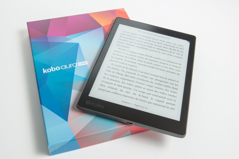
If your book is going digital, export to EPUB format. EPUB is the standard for e-readers like Kindle (with some tweaks), Apple Books, and most other platforms. Unlike a PDF, which locks your layout in place, EPUB is reflowable—it adapts to whatever screen size the reader is using.
When formatting for EPUB, think about how your book will look on a phone screen, a tablet, and an e-reader. Text should remain readable. Images should scale properly. Tables need to reflow without becoming unreadable. Links should be active and functional.
EPUB files require clean HTML under the hood. Sloppy formatting in your original document creates problems when you convert to EPUB. This is another area where professional help pays off—the difference between a sloppy EPUB that crashes on certain devices and a clean, compatible file is formatting expertise.
Using Word and InDesign for Book Formatting
Two main tools handle book formatting: Microsoft Word and Adobe InDesign. Word is accessible and familiar to most writers. It's fine for simpler projects and can produce acceptable results if used carefully. InDesign is the industry standard for professional publishing and gives you far more control over typography, spacing, and design details.
If you're formatting in Word, use styles consistently. Don't manually format each heading or paragraph. Create a style for body text, another for headings, another for subheadings, and use them throughout. This keeps your formatting clean and makes conversion to other formats easier.
InDesign offers professional-grade control but requires training. You can manage columns, precise kerning, advanced typography features, and complex layouts that Word simply can't match. For commercial publishing, InDesign is the default choice.
Neither tool is "better"—it depends on your project's complexity and your comfort level. Simple novels might work in Word. Illustrated books, complex layouts, and books with multiple columns or sidebars demand InDesign. If you're uncertain, Xcel Graphic Services can assess your manuscript and recommend the right approach.
Images, Tables, and Special Elements

Images need to be high-resolution for print (at least 300 DPI). Low-res images look blurry and unprofessional. Place images strategically—anchor them near relevant text so readers understand their context. Add captions when necessary.
Tables require careful formatting. Ensure headers are bold and distinct. Keep text inside cells readable. If a table is too wide, consider breaking it across pages or rotating it to landscape orientation. Tables in EPUB format are tricky—they often need simplified formatting to reflow properly on small screens.
Pull quotes, sidebars, and callout boxes add visual interest but need consistent styling. Don't overuse them. A well-placed pull quote draws attention to key ideas. Too many elements competing for space create chaos.
Proofreading and Final Review
Formatting doesn't end when your layout looks good. Print a sample spread and review it on paper. Text that looks fine on screen sometimes reveals problems when printed. Check that spacing is even, fonts are clear, and page breaks fall in logical places (not cutting off a paragraph awkwardly).
Review page numbers. Check that your table of contents page numbers match actual page numbers. Verify that headers and footers appear correctly. Test links in your EPUB version on multiple devices.
This review phase catches formatting mistakes that could embarrass you after publication. Small gaps between chapters, inconsistent indentation, or a heading that's slightly off-alignment all signal amateurism. Professional formatting means these details are locked down before your book goes to print or digital distribution. If you want a thorough quality check on your formatted manuscript, Xcel Graphic Services offers specialized review and refinement to ensure every detail meets publishing standards.
Common Book Formatting Mistakes to Avoid
Don't use two spaces after periods. That's a typewriter habit. Modern typography uses one space.
Don't mix fonts randomly. Stick to your chosen palette.
Don't indent every paragraph. Indent the first paragraph of a chapter, then skip the indent after chapter breaks and section breaks for visual clarity.
Don't use tabs to create indents. Use the indent function in your formatting software. Don't manually adjust spacing to fix layout problems. Use proper styles and structure.
Don't forget about widows and orphans—single words or short lines that land alone at the top or bottom of a page. They look sloppy. Professional formatting eliminates them.
When to Hand It Off to a Professional
If your book is simple—a straightforward novel with minimal images and standard layout—you might format it yourself with careful attention to basics. But if your book includes images, multiple chapters, complex structure, or if you're creating both print and digital versions, professional help is worth it.
Formatting takes time and requires technical knowledge. Getting it wrong results in books that look cheap and unprofessional. A single poorly formatted book can damage your reputation as an author or publisher.
Professional formatters understand the technical requirements of different platforms and can produce publication-ready files in all formats at once. They catch mistakes you'll miss. They know industry standards and apply them consistently. The investment pays for itself in a finished product that reflects your work with the polish it deserves.
Frequently Asked Questions
What is the standard body text size for book formatting?
Most professionally published books use 10 to 12 point font for body text. The exact size depends on your trim size, font choice, and how much text you want per page. Smaller trim sizes typically use 10 or 10.5 point; larger trim sizes can go to 12 point. Readability comes first—never go smaller than 10 point.
Can I format my book in Microsoft Word?
Yes, Word can produce an acceptable formatted book for simpler projects. Use styles consistently, set proper margins and trim size, manage page breaks deliberately, and export carefully to PDF for print or EPUB for digital. Word has limitations for complex layouts, but many books are published using it. If you're comfortable with Word and your book design is straightforward, it's viable.
What does EPUB format mean and why does it matter?
EPUB is a digital file format designed for e-readers and tablets. Unlike PDF, which locks layout in place, EPUB reflows text to fit whatever screen the reader uses. EPUB is the standard for platforms like Apple Books, Kobo, and most e-reader devices. If you're publishing a digital version, EPUB ensures maximum compatibility and a better reading experience across devices.
What is bleed in book formatting?
Bleed is the area that extends slightly beyond your final trim size, usually 0.125 inches. If an image or colored background extends to the edge of your page, it must extend into the bleed area. This ensures that when the printer cuts your book to final size, you don't end up with white edges. If your design doesn't extend to the edge, bleed doesn't matter.
Frequently Asked Questions
What is the standard body text size for book formatting?
Most professionally published books use 10 to 12 point font for body text. The exact size depends on your trim size, font choice, and how much text you want per page. Smaller trim sizes typically use 10 or 10.5 point; larger trim sizes can go to 12 point. Readability comes first—never go smaller than 10 point.
Can I format my book in Microsoft Word?
Yes, Word can produce an acceptable formatted book for simpler projects. Use styles consistently, set proper margins and trim size, manage page breaks deliberately, and export carefully to PDF for print or EPUB for digital. Word has limitations for complex layouts, but many books are published using it. If you're comfortable with Word and your book design is straightforward, it's viable.
What does EPUB format mean and why does it matter?
EPUB is a digital file format designed for e-readers and tablets. Unlike PDF, which locks layout in place, EPUB reflows text to fit whatever screen the reader uses. EPUB is the standard for platforms like Apple Books, Kobo, and most e-reader devices. If you're publishing a digital version, EPUB ensures maximum compatibility and a better reading experience across devices.
What is bleed in book formatting?
Bleed is the area that extends slightly beyond your final trim size, usually 0.125 inches. If an image or colored background extends to the edge of your page, it must extend into the bleed area. This ensures that when the printer cuts your book to final size, you don't end up with white edges. If your design doesn't extend to the edge, bleed doesn't matter.