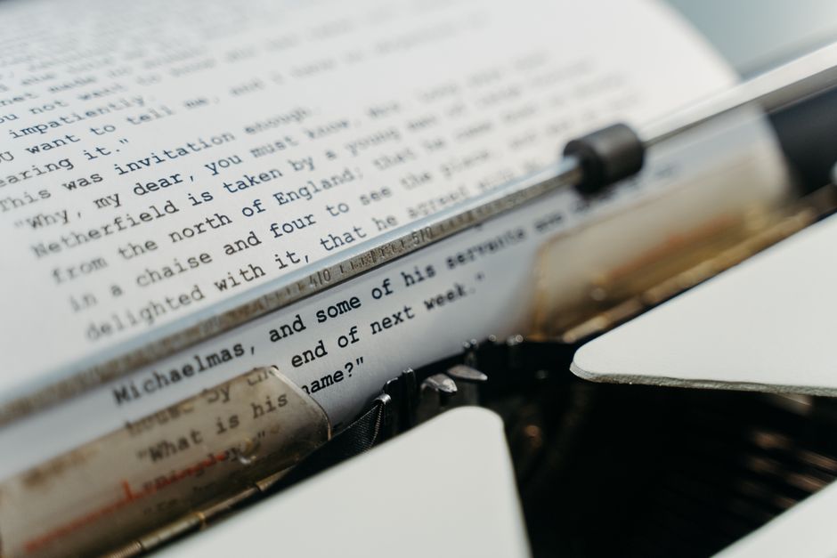

Technical typesetting for STEM textbooks is fundamentally different from laying out a novel or a memoir. You're not just arranging words on a page. You're managing equations, integrating diagrams, handling complex citations, and ensuring every visual element aligns perfectly with the text. The stakes are high because readers rely on your layout to understand difficult concepts.
If you're publishing a science, technology, engineering, or math textbook, the typesetting process shapes how students learn. A misaligned equation, a poorly placed figure, or inconsistent font choices can confuse readers and undermine your content's credibility. This guide walks you through what makes technical typesetting work and how to get it right.
Related: Typesetting Tables and Figures in Textbooks: A Guide
Related: Complex Table Typesetting for Technical Books: A Complete Guide
Why Technical Typesetting for STEM Textbooks Requires Specialized Tools
Regular word processors and design software often fall short when you're working with technical content. STEM textbooks demand tools built specifically to handle mathematical notation, scientific imagery, and precise spacing.
LaTeX stands out as the industry standard for technical textbooks. It's built from the ground up to handle equations beautifully, manage large documents without slowing down, and produce consistent output across print and digital formats. If you're working with heavy mathematical content, LaTeX gives you control and precision that generic design platforms can't match.
Professional tools like Adobe InDesign also work well for technical typesetting when configured properly. InDesign lets you integrate high-resolution images, manage complex page layouts, and maintain visual consistency throughout a lengthy manuscript. The key is using the right tool for your specific content type.
Whether you choose LaTeX or InDesign, the goal is the same: create a layout that makes technical information accessible and visually clear. If managing these technical workflows feels overwhelming, Xcel Graphic Services can handle the typesetting work and deliver publication-ready files for both print and digital editions.

Font Selection and Readability in Technical Documents
Your font choice matters more in a STEM textbook than you might think. A poorly selected typeface makes dense technical material even harder to read.
Serif fonts like Times New Roman or Garamond have been textbook standards for decades. Serifs help guide the reader's eye along lines of text, which is especially valuable when pages contain dense equations and technical explanations. The familiarity of these fonts also reassures readers that they're engaging with authoritative, academic content.
Sans-serif fonts like Helvetica or Calibri work well for headings, captions, and figure labels. They create visual contrast and help readers navigate the document's hierarchy. Many technical textbooks pair a serif body font with a clean sans-serif for headers and annotations.
Size and spacing matter just as much as the typeface itself. Equations often require slightly larger type than body text to remain legible. Mathematical symbols need breathing room around them. Captions under diagrams should be smaller than body text but still readable without magnification.
Consistency across your entire manuscript is non-negotiable. Every heading should use the same font, size, and spacing. Every equation should follow the same formatting rules. Every figure caption should look identical in structure and style. Readers trust consistency, and it makes the document feel professional and intentional.
Managing Equations, Images, and Diagrams
Equations are the backbone of STEM textbooks, and they demand careful integration into your layout. Standalone equations should be centered on their own line with space above and below to distinguish them from surrounding text. Inline equations (ones embedded in a paragraph) need slightly different treatment to maintain line spacing and readability.
Each equation should be numbered sequentially so readers can reference them easily. The numbering system should be consistent throughout the book, often resetting with each chapter or section. Clear numbering helps instructors and students discuss specific formulas without confusion.
Images and diagrams are equally critical. A high-resolution figure can explain a concept that would take paragraphs of text to describe. But poor placement or low quality ruins that advantage. Diagrams should appear close to the text that references them. If a diagram belongs to a paragraph on page 5, don't force it onto page 8.
Image resolution matters for both print and digital formats. Print editions need high-resolution files (at least 300 DPI) to reproduce crisp diagrams and photographs. Digital formats like PDFs and eBooks have different requirements but still need quality images to display clearly on tablets and screens.
Captions and labels should be concise but informative. They guide readers through the visual content and connect diagrams back to the surrounding text. A reader should understand what a diagram shows without re-reading multiple paragraphs.
Citation Management and Reference Systems

STEM textbooks often include extensive citations and references. Your typesetting system needs to handle citations reliably and automatically format them consistently.
LaTeX excels at citation management through built-in bibliography systems. You can tag citations as you write, and LaTeX automatically formats and numbers them in your chosen citation style. If you switch from one citation style to another, the system can reformat everything with a single command.
In InDesign, citation management requires more manual work, but it's still manageable through careful use of cross-references and field codes. The important thing is establishing your citation system early and maintaining it rigorously throughout the project.
Your citations should link smoothly between the main text and a bibliography at the end of the chapter or book. Footnotes and endnotes should be formatted consistently. If you're producing a digital version, hyperlinked citations are a huge usability bonus for readers.
Maintaining Consistency Between Print and Digital Versions
Many STEM textbooks now exist in both print and digital formats. Your typesetting workflow should support both without compromising quality in either version.
Print and digital layouts don't have to be identical, but they should feel like the same book. The same font family, heading hierarchy, and visual organization should carry through both versions. Images, equations, and diagrams should appear in the same relative position to their text references in both formats.
Digital formats often require adjustments that print doesn't. Hyperlinks between chapters, searchable text, and reflowable layouts for mobile devices are digital strengths. Footnotes might become pop-ups instead of page-bottom notes. Image sizing might adjust for smaller screens. These adaptations should enhance readability without changing the fundamental design.
A professional typesetting team tracks consistency across formats automatically. Xcel Graphic Services manages both print and digital output, ensuring your STEM textbook looks polished and functions smoothly regardless of how readers access it.
Page Layout Precision and White Space
Technical content is dense. Readers absorb complex information more easily when pages have breathing room.
White space (the empty area around text and images) isn't wasted space. It separates ideas, guides the reader's eye, and makes pages feel less overwhelming. In a STEM textbook, strategic white space actually improves comprehension.
Margins should be generous enough to accommodate reader notes and annotations. A 1-inch margin is standard, but textbooks sometimes use slightly larger margins to give readers space to write.
Column width affects readability. Lines that are too wide (more than 70-80 characters) tire readers' eyes. Lines that are too narrow look choppy. Finding the right balance between margins, font size, and column width is part of technical typesetting expertise.
Headers, footers, and page numbers should be consistent and unobtrusive. In a multi-chapter textbook, many readers find it helpful to see the chapter title in the header and the page number in the footer. This navigation support becomes especially valuable in digital formats where readers lack the tactile page-flip feedback of print.
Quality Control and Proofing for Technical Content

Errors in STEM textbooks carry real consequences. A misplaced decimal point, a typo in an equation, or an incorrect diagram label can mislead students for an entire semester.
Proofing technical content requires multiple passes. The first pass should check for layout consistency: Do all headings look the same? Are equations formatted uniformly? Are figure captions styled identically? The second pass should verify that text, equations, and diagrams align correctly. The third pass should catch typos, citation errors, and factual mistakes.
Specialized proofreaders who understand your technical subject matter catch errors that generalists miss. Someone familiar with mathematics will spot an equation error. Someone versed in chemistry will catch labeling problems in molecular diagrams.
Print and digital versions should be proofed separately, even if they share the same content. A layout that looks perfect in print might display poorly on a tablet. Hyperlinks might not work in digital formats. Page breaks occur in different places. Each format deserves its own quality review.
Common Questions About Technical Typesetting for STEM Textbooks
Should I use LaTeX or InDesign for my STEM textbook?
Both work well for technical content. LaTeX excels at handling complex mathematics and large documents with automatic formatting. InDesign gives you more visual control and integrates smoothly with standard publishing workflows. If your textbook is equation-heavy, LaTeX is often the better choice. If you need fine-grained design control and have fewer equations, InDesign works great. The best choice depends on your team's expertise and your content's specific demands.
How do I ensure my images look good in both print and digital formats?
Start with high-resolution source files (300 DPI for print). Create print-ready versions at full resolution, then generate lower-resolution versions for digital formats optimized for screen display. Test digital images on actual devices (tablets, phones) to confirm they remain readable and clear. This dual-format approach takes more work upfront but delivers professional results in both media.
What's the best way to handle equation numbering in a multi-chapter textbook?
Most textbooks number equations chapter-by-chapter, so the first equation in Chapter 3 becomes Equation 3.1, the second is 3.2, and so on. This system resets with each chapter and makes it easy for readers to locate specific equations. Set up your numbering system in your typesetting tool early so it generates automatically as you add equations. Manual numbering leads to errors and becomes a nightmare if you revise.
How much white space should I leave around figures and diagrams?
Place figures close to the text that references them, ideally within the same page or on the facing page. Add space above and below figures to separate them visually from body text. Typically, 12-18 points of space (vertical distance) works well. Use consistent spacing throughout the document so figures feel intentionally placed rather than randomly scattered. Labels and captions should be close to their images without appearing cramped.
Frequently Asked Questions
Should I use LaTeX or InDesign for my STEM textbook?
Both work well for technical content. LaTeX excels at handling complex mathematics and large documents with automatic formatting. InDesign gives you more visual control and integrates smoothly with standard publishing workflows. If your textbook is equation-heavy, LaTeX is often the better choice. If you need fine-grained design control and have fewer equations, InDesign works great. The best choice depends on your team's expertise and your content's specific demands.
How do I ensure my images look good in both print and digital formats?
Start with high-resolution source files (300 DPI for print). Create print-ready versions at full resolution, then generate lower-resolution versions for digital formats optimized for screen display. Test digital images on actual devices (tablets, phones) to confirm they remain readable and clear. This dual-format approach takes more work upfront but delivers professional results in both media.
What's the best way to handle equation numbering in a multi-chapter textbook?
Most textbooks number equations chapter-by-chapter, so the first equation in Chapter 3 becomes Equation 3.1, the second is 3.2, and so on. This system resets with each chapter and makes it easy for readers to locate specific equations. Set up your numbering system in your typesetting tool early so it generates automatically as you add equations. Manual numbering leads to errors and becomes a nightmare if you revise.
How much white space should I leave around figures and diagrams?
Place figures close to the text that references them, ideally within the same page or on the facing page. Add space above and below figures to separate them visually from body text. Typically, 12-18 points of space (vertical distance) works well. Use consistent spacing throughout the document so figures feel intentionally placed rather than randomly scattered. Labels and captions should be close to their images without appearing cramped.